AWIS group
AWIS stands for Advanced Web & IT Solutions. For AWIS group, s. r. o. – a family of brands in IT, sport, events and construction – we redrew the logo and put together a brand manual. The leaf in the letter A and the green say that AWIS is connected with nature and that its solutions take nature into account.
A logo that grows.
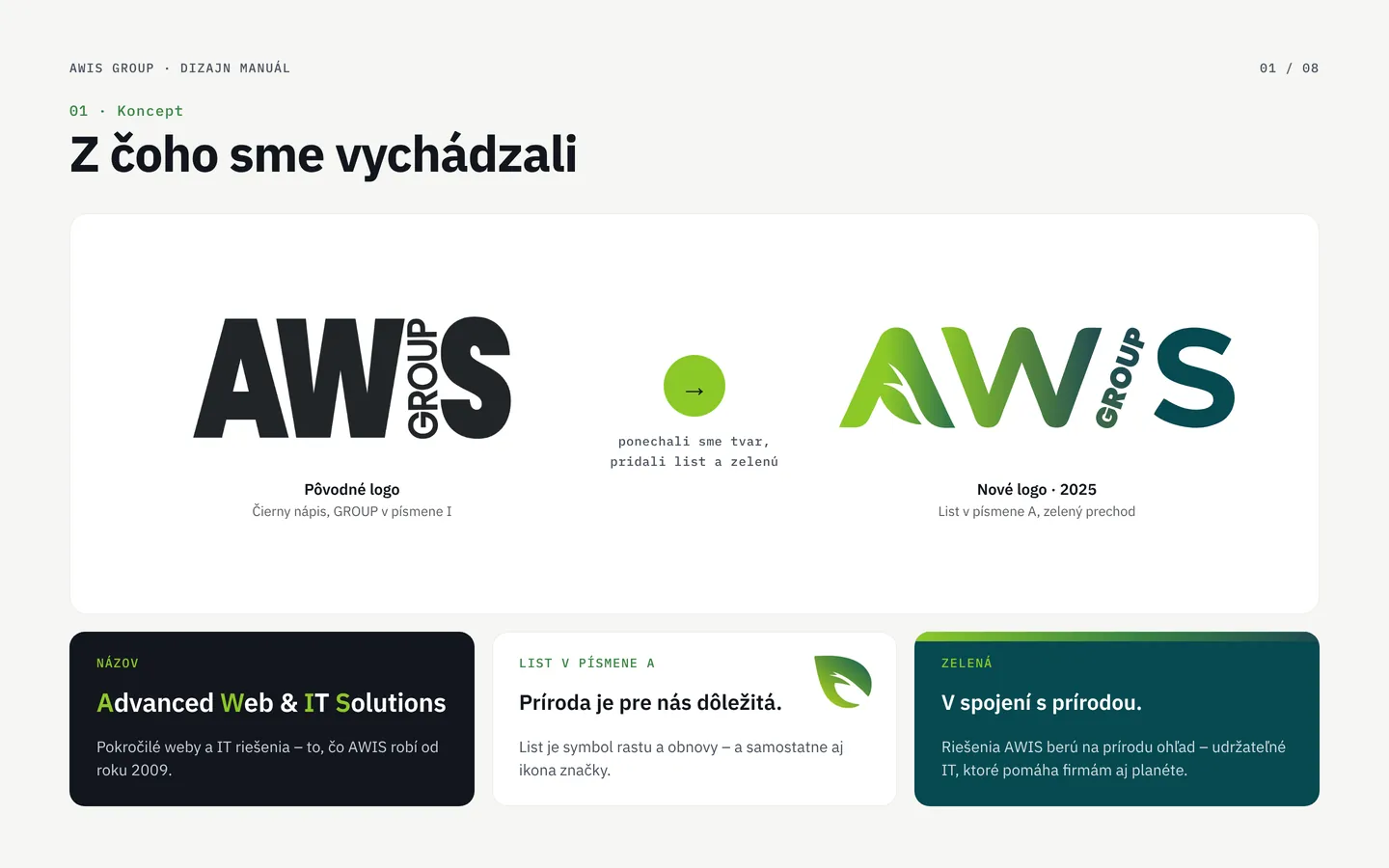
We started from the original logo – a bold black wordmark with GROUP in the letter I. We kept the shape and added a leaf in the letter A and the green. The brand manual keeps the logo, icon, colours and type consistent across the group websites, documents and social media.
- Client
- AWIS group, s. r. o., Žilina
- Scope
- Logo redesign · icon · brand manual
- New logo
- March 2025
- Manual
- 8 chapters
-
 Z1Warm-up
Where we started
The original logo was a bold black AWIS wordmark with GROUP turned into the letter I. We kept the shape people know and added a leaf in the letter A and the green: nature matters to AWIS and its solutions take it into account. The name itself stands for Advanced Web & IT Solutions.
-
 Z1Warm-up
Why a new logo
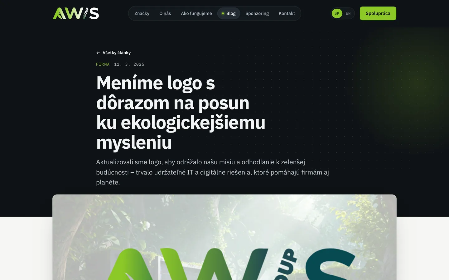
AWIS wanted the logo to speak about where it is heading: sustainable IT and digital solutions that help businesses and the planet. The group announced the change in a blog article in March 2025.
-
 Z2Base
Logo and clear space
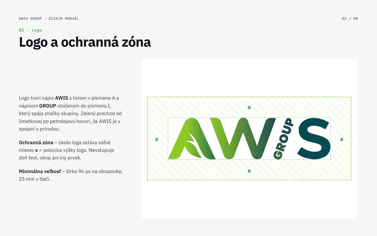
The AWIS wordmark with a leaf in the letter A and GROUP turned into the letter I, connecting the brands of the group. A clear space surrounds the logo; the minimum width is 96 px on screen and 25 mm in print.
-
 Z2Base
An icon from the leaf in A
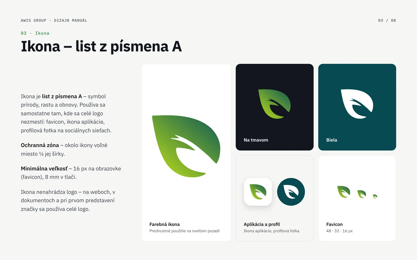
The leaf from the letter A also works on its own – as a favicon, an app icon or a social media profile picture, wherever the full logo does not fit. In colour, on dark and in white, from 16 px.
-
 Z2Base
Variants for every background
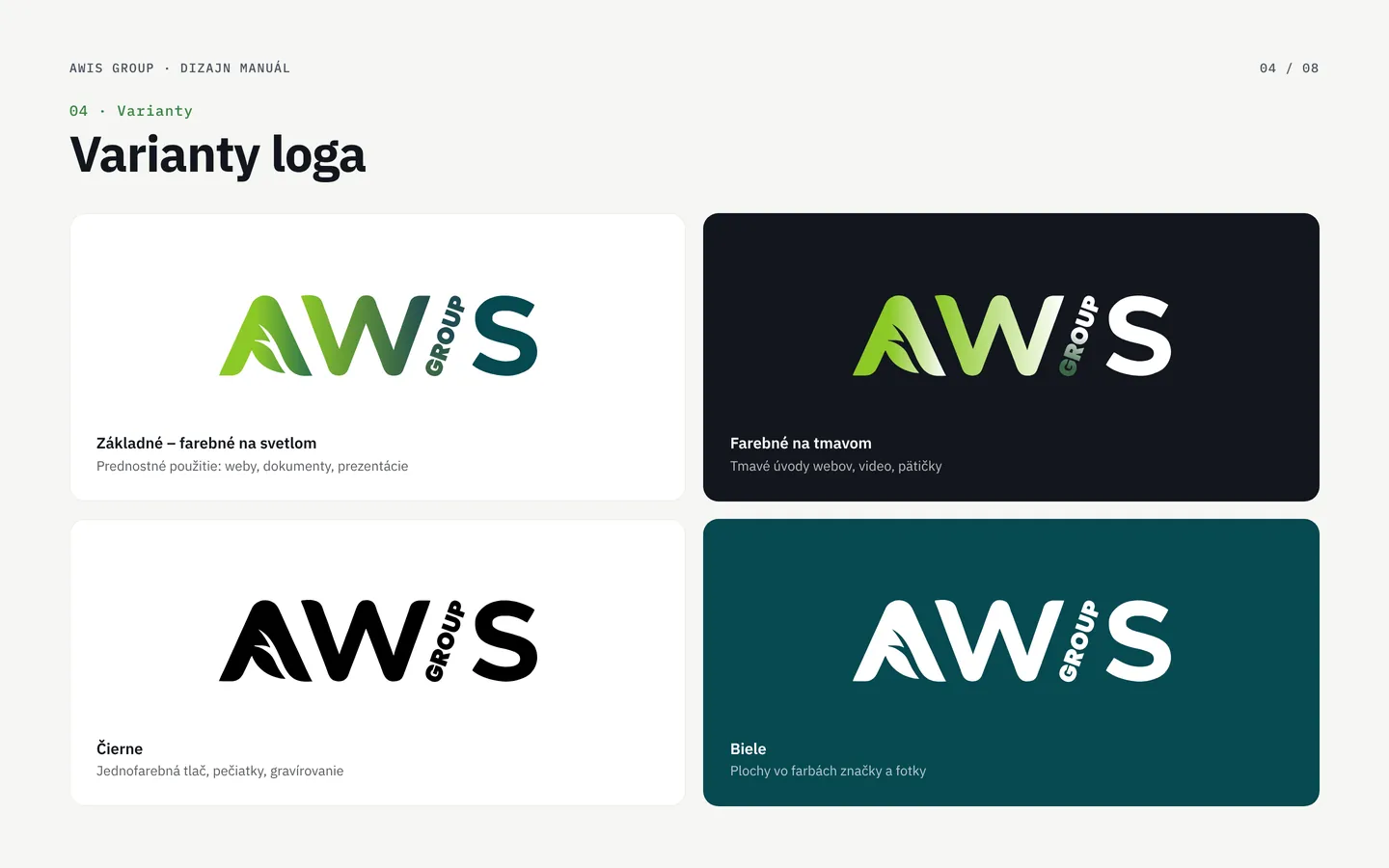
The primary colour logo on light backgrounds, the colour logo for dark website intros and video, black for one-colour print and white for brand colour areas and photos.
-
 Z3Tempo
Colours from lime to petrol
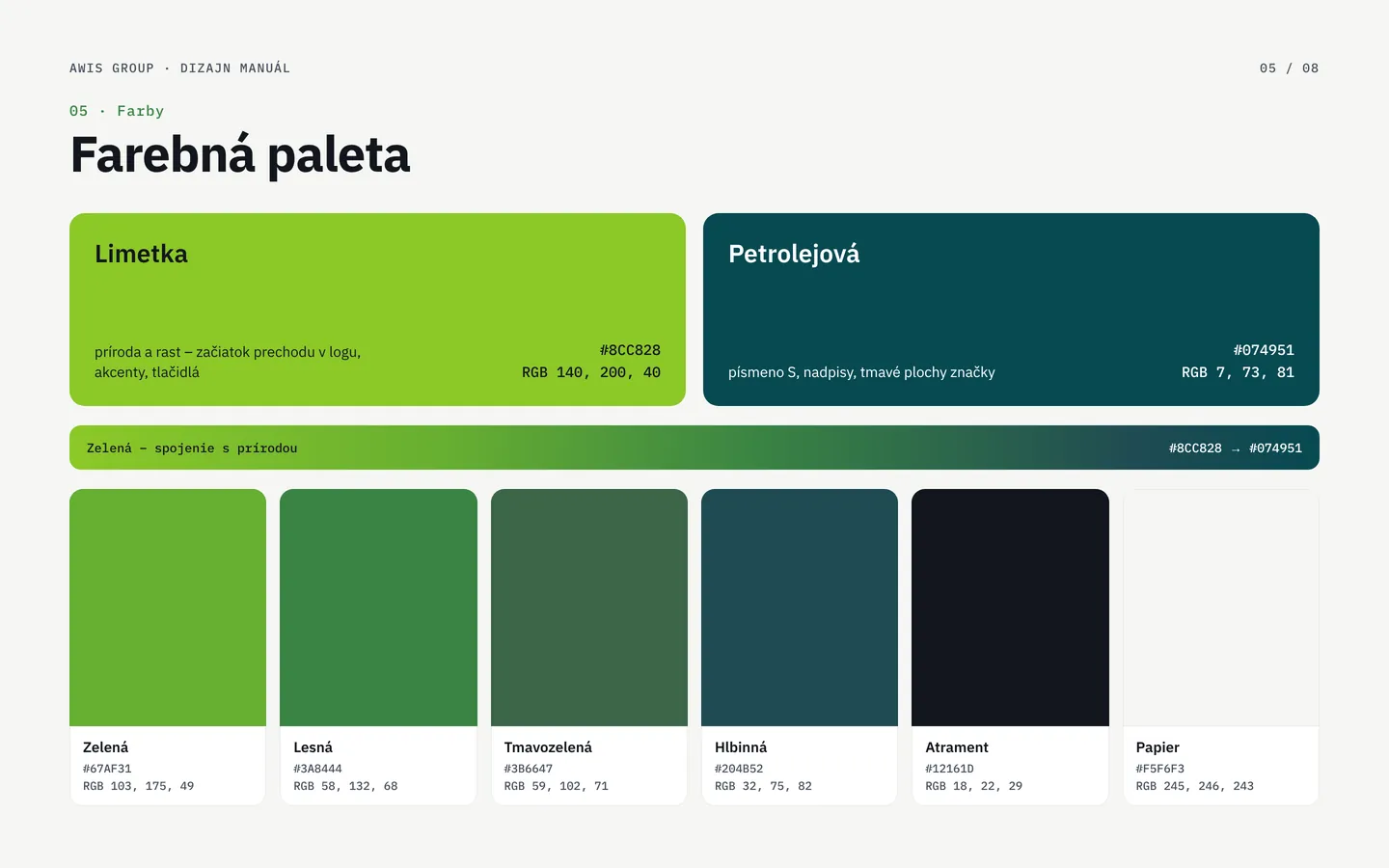
Green is the bond with nature. Two primary colours – lime #8CC828 and petrol #074951 – and the gradient between them that carries the logo. Supporting greens, ink and paper with HEX and RGB values.
-
 Z3Tempo
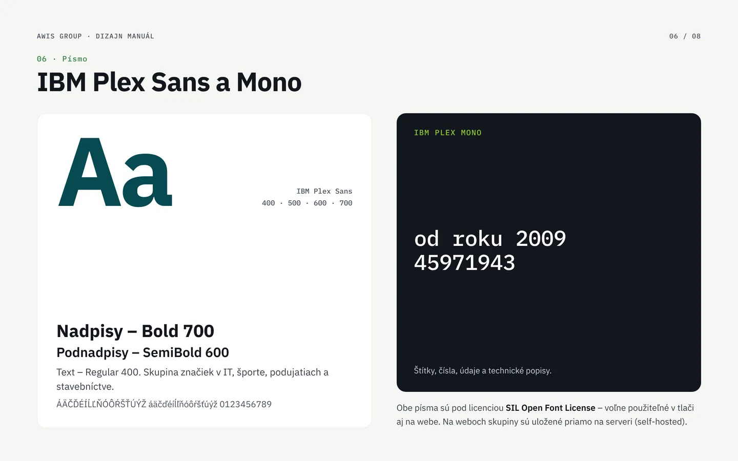
The IBM Plex typeface
IBM Plex Sans for headings and text, IBM Plex Mono for labels and numbers. Both typefaces are free to use and self-hosted on the group websites.
-
 Z4Threshold
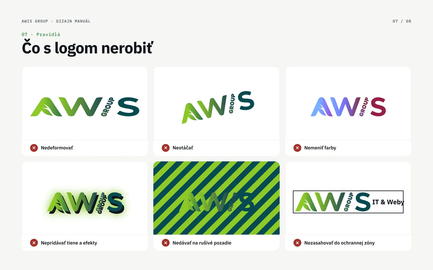
What not to do with the logo
The logo is not stretched, rotated or recoloured, gets no shadows or effects, is not placed on busy backgrounds and nothing enters its clear space.
-
 Z5K.O.
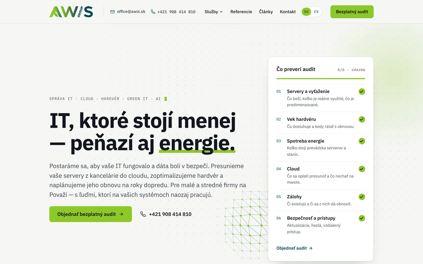
The logo in use
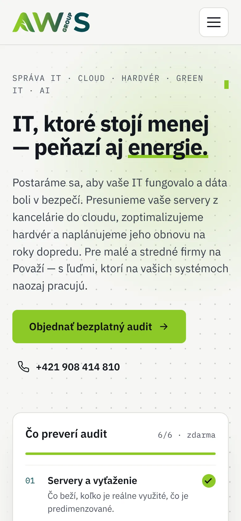
The colour logo on the light awis.sk website, the logo for dark backgrounds in the awis.group intro, in footers, link previews and on social media – always according to the manual.
What the brand manual covers
- Concept – the original and the new logo, the meaning of the name Advanced Web & IT Solutions and of the green.
- Logo – construction, clear space and minimum size.
- Icon – the leaf from the letter A, its variants and use as a favicon or app icon.
- Variants – colour on light and dark backgrounds, black and white.
- Colours – lime and petrol, the logo gradient and supporting colours in HEX and RGB.
- Type – IBM Plex Sans and IBM Plex Mono with weights and usage.
- Rules – what not to do with the logo.
- Usage – websites, footers, link previews and social media.
The manual is the reference for everyone who works with the brand – from the group websites to documents and social media posts. The same rules apply to AWIS and to external suppliers.
Need a new logo and the rules to go with it?
We redraw the logo, prepare its variants and a brand manual so your brand looks the same everywhere. Write to us and we will prepare a game plan.